
What if the detail that makes your label feel premium also makes essential product information harder to read? The right premium product label finishes should strengthen your brand’s presence, not compete with the product name, ingredients or other details customers need.
It’s understandable to focus first on appearance. Gloss, matte and tactile effects can change how a label catches the light and feels in the hand, but the best choice also needs to suit the product, packaging and conditions in which it will be handled or stored. A finish that looks striking on screen may create a different impression on the finished pack.
This guide explains the main visual and tactile finish categories, how they influence brand perception, and what to consider when balancing standout design with clear, practical labelling. You’ll also learn how to prepare a useful brief for bespoke commercial label printing, from the label’s role in your product identity to the packaging it needs to work alongside. With those points in view, you can choose a finish with purpose and make your label more noticeable for the right reasons.
Key Takeaways
- Assess a finish by how it supports your product’s identity and first impression, not simply by how eye-catching it looks.
- Understand the difference between label material, print treatment and surface finish before comparing options.
- Compare premium product label finishes by their visual or tactile effect, packaging context and practical trade-offs.
- Start with the product’s shape, handling and storage needs, then choose a finish that suits the brand.
- Prepare a clear print brief that brings together label design, packaging and the impression you want customers to take away.
Why premium product label finishes matter beyond appearance
A label is part of the product experience, not simply a space for a name. Its finish is a surface treatment or material choice that changes how the label looks, feels or functions. As the Label (Wikipedia) overview explains, labels can serve different purposes and use different materials and attachment methods. A finish helps shape the first impression on a shelf, in a parcel or in a customer’s hand, offering visual cues about the product and the brand behind it.
That impression can support perceived quality, but “premium” doesn’t automatically mean more suitable. A high-sheen surface might catch the eye, whilst a quieter texture may better fit a natural or understated identity. Choose a finish that works with the product’s visual identity and the whole packaging experience. If it draws attention away from the product name or key information, it may work against the design.
A premium label finish is worth considering when it strengthens the brand impression and suits the product’s real-life use without compromising clarity.
What makes a product label finish feel premium?
Perception often comes from the relationship between sheen, texture, contrast and application. A controlled shine or tactile surface can create a deliberate point of difference, while clean edges and consistent placement help the overall label feel considered. These details work best when they reinforce the brand’s character rather than compete for attention.
For example, a simple jar label might use a subtle surface contrast to distinguish the product name from the surrounding design. On a small bottle, a highly decorative treatment could make the front feel crowded. Limiting the label to one clear focal detail can preserve space for branding and product information.
When should a finish serve a practical purpose?
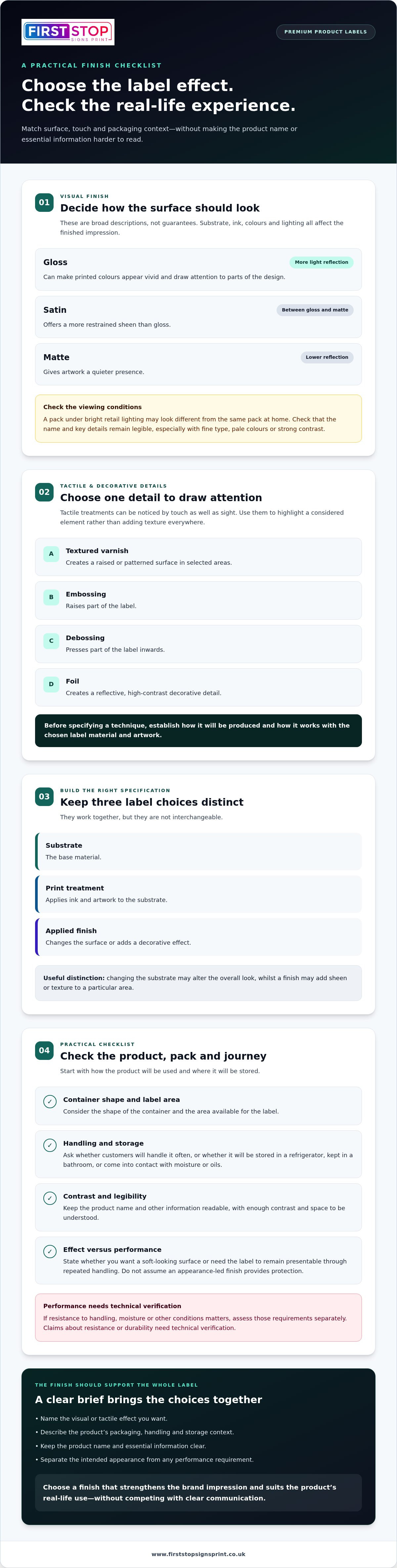
Start with the product’s journey. Will customers handle it often? Is the pack stored in a refrigerator, kept in a bathroom or likely to come into contact with moisture or oils? These conditions can affect what the label needs to withstand. Don’t assume that a finish chosen for appearance also provides protection. Performance depends on the materials and production choices, and any claims about resistance or durability need technical verification.
Separate the intended effect from the expected performance in your brief. For example, explain whether you want a soft-looking surface or whether the label must remain presentable through repeated handling. Then consider how the finish works with:
- the container’s shape and the area available for the label
- the way the product will be stored and handled
- the contrast and legibility of the product name and other information
Appearance must never come at the expense of clear communication. Make sure required product information remains readable against the chosen surface, with enough contrast and space to be understood. A well-considered finish brings brand character and practical needs together, rather than asking one to take priority over the other.
How premium product label finishes create different effects
Before comparing surface effects, separate three parts of the label. The substrate is the base material; the print treatment applies ink and artwork to it; an applied finish changes the surface or adds a decorative effect. These choices work together, but they aren’t interchangeable. Changing the substrate may alter the overall look, whilst a finish may add sheen or texture to a particular area.
This distinction turns a general request for a “premium” look into a clearer brief. Packaging organisations such as PMMI - The Association for Packaging and Processing Technologies offer wider industry context, but the label effect still needs to be judged against your artwork, container and intended customer experience.
Gloss, matte and satin label finishes
Gloss reflects more light, which can make printed colours appear vivid and draw attention to parts of the design. Matte has a lower-reflection appearance, giving artwork a quieter presence. Satin sits between the two, with a more restrained sheen. These are broad descriptions, not guarantees: the substrate, ink, colours and lighting all affect the finished impression.
A product viewed under bright retail lighting, for instance, may look different from the same pack at home. Check that the product name and key details remain legible, especially if the artwork uses fine type, pale colours or strong contrast. The label’s shape and position on the pack matter too.
Tactile and decorative label treatments
Some techniques are designed to be noticed by touch as well as sight. Textured varnish creates a raised or patterned surface in selected areas. Embossing raises part of the label, whilst debossing presses it in. Foil creates a reflective, high-contrast decorative detail. These terms describe intended effects, and names and results can vary between materials and production methods.
Use a tactile detail to draw attention to a considered element, such as a symbol or brand mark, rather than adding texture everywhere. Before specifying a technique, establish how it will be produced and how it works with the chosen label material and artwork.
Match the effect to the purpose
A finish may be primarily visual, tactile or functional. Don’t assume a decorative treatment also protects the label or improves its performance. If resistance to handling, moisture or other conditions matters, those requirements need separate technical assessment. Keep the customer’s first interaction in view, but make clarity the priority.
Visual finishes shape what customers see; tactile treatments change what they feel; functional choices address how a label is intended to perform.
Once you’ve identified the effect you want, connect it to the label design and the packaging as a whole. A bespoke commercial label printing project brings design and production together around a considered brief, helping the label contribute coherently to the product’s presentation.
Premium label finishes compared: match the effect to the product
There’s no single finish that suits every premium pack. Compare options against the product category, container shape and customer interaction, rather than treating one effect as a universal quality upgrade. The table gives general illustrations, not guarantees of suitability or performance.
| Finish type | Visual or tactile effect | Illustrative context | Key trade-off |
|---|---|---|---|
| Gloss surface | Reflective, with a pronounced sheen | A beverage bottle designed to stand out on a bright shelf | Reflections may compete with small text or alter how colours appear under different lighting. |
| Matte surface | Low-reflection and visually restrained | A food jar with a calm, understated brand identity | Subdued artwork may have less visual contrast in some settings. |
| Satin surface | A measured sheen between gloss and matte | A household product label aiming for a balanced look | The effect depends on the artwork and lighting, so it may not appear identical in every environment. |
| Textured treatment | A noticeable surface or tactile detail | A beauty product using a tactile brand accent | Texture can add visual complexity and needs to be considered alongside fine text. |
| Embossed or debossed detail | A raised or pressed-in design element | A premium beverage or beauty pack with a prominent brand mark | It changes the label’s surface and should be assessed with the material and pack shape. |
| Foil detail | A reflective, high-contrast accent | A small decorative feature on a gift-oriented product | Used across too much of the design, it may distract from the product identity or information. |
These examples help frame the design decision, not establish technical suitability. The final result depends on the complete label construction, including its material and applied treatments, as well as the container and how the product is stored and handled. For curved bottles or jars, consider how the label sits on the contour and whether key design elements remain easy to see from likely viewing angles.
Which finish suits premium food and drink packaging?
For food jars, bottles and beverage containers, consider shelf visibility alongside the shape and available label area. Frequent handling may influence the brief, whilst chilled storage, moisture or condensation should be stated as requirements for technical assessment, not assumed to be covered by a particular finish. Keep product details readable, and treat packaging and label requirements as a separate compliance matter. A surface effect alone doesn’t establish that information is compliant.
Which finish suits beauty and household products?
A beauty label might use a restrained effect to support a minimal brand, or a tactile accent to create a more considered interaction. A household cleaner, by contrast, may need an instantly recognisable design that stays clear as the pack is handled repeatedly. For either category, account for bathroom moisture, product residue and the way customers grip the container. These are conditions to specify and assess against the complete construction, not claims that a finish will withstand them.
Use premium product label finishes to express the product’s character, while judging each option against its packaging context and verified specification. Comparing them this way keeps appearance, handling and clear communication in view together.
How to choose a premium product label finish
A clear selection process keeps the finish connected to the pack, product and brand. Decide what the label needs to do in use before choosing a visual effect. This helps you brief premium product label finishes with purpose, rather than relying on broad terms such as “luxury” that can mean different things to different people.
Start with the packaging, product and customer
Record the pack’s shape and surface, how the label will be applied, and the conditions it may encounter during storage and handling. Then describe the impression you want customers to take away, for example modern, understated, tactile or high-impact. Keep essential readability needs separate from optional decorative details.
- Describe the product and pack. Note the container material, shape, label position and available space. A curved bottle, for instance, presents a different layout context from a flat box.
- Map the label’s use. Explain how customers will hold or handle the product, and whether storage conditions or contact with moisture, oils or residue are relevant. Treat any performance expectation as a requirement for technical assessment, not an assumed finish benefit.
- Set the brand direction. Choose a few plain-language cues, such as “quiet and natural” or “bold with one reflective accent”. This gives the design a clear visual goal without prescribing several competing effects.
- Protect clear communication. Identify the product name and other essential information first. Review the artwork at the intended label size, paying particular attention to small text, contrast and how the layout sits on the pack.
- Consider material and adhesive context. These are part of the label construction, not the same thing as its surface appearance. The professional vinyl sticker printing guide offers related context on material and adhesive considerations.
Turn the finish choice into a clear print brief
Translate your preferences into details a designer and production team can use. Include the artwork, label dimensions, packaging context, intended customer impression and any handling or storage requirements. Describe the desired appearance in everyday language, such as “low reflection across the background” or “a tactile detail on the brand mark”. If you have a visual reference, explain what you like about it rather than assuming the same result will transfer directly to another pack.
Finally, state what must stay clear and what is optional. That distinction keeps the design focused and makes trade-offs easier to discuss. First Stop Signs Print provides bespoke label design and production, aligning the finished label with the packaging brief. Start a bespoke label printing project with a considered outline of your product, pack and intended effect.
Bring your premium label finish into a bespoke print project
A finish decision is most useful when it’s part of a joined-up label brief. Product, packaging, artwork and handling conditions all shape how a label needs to look and work. Describe these together to give design and production a clearer basis for creating a label that supports the product’s identity rather than feeling like a decorative extra.
What to include in a label-printing brief
Start with the practical details, then explain the impression you want customers to take away. Technical terms can help, but plain-language references make your intention clearer. Include:
- product type, packaging material, container shape and label dimensions
- expected handling and storage conditions, including any relevant contact with moisture or product residue
- brand assets, artwork files and the essential copy that must appear on the label
- the desired look and feel, such as understated, tactile or visually prominent
- any priorities for information clarity, colour contrast or the prominence of the brand mark
If you’re using a reference image, note what you want to emulate, perhaps its restrained sheen or the way a detail stands out. This is more useful than relying on a broad word such as “premium”, which may suggest different effects to different people.
From finish decision to finished label
A well-prepared brief gives design and production a shared point of reference. First Stop Signs Print provides bespoke commercial label design and production, bringing the supplied artwork, packaging context and intended customer impression into one considered project. The brief keeps choices connected to the label’s purpose, without assuming a particular effect is right for every product.
Before the artwork is prepared for production, make the hierarchy clear: brand and product recognition should work alongside the information customers need to read. A premium effect should support that hierarchy, not obscure it. Include the label in its packaging context so the design can be considered as part of the finished product, rather than as an isolated surface.
It also helps to distinguish a visual preference from a performance requirement. Describe the conditions the label is expected to encounter, and treat any claims about resistance or durability as matters for technical assessment. This keeps the brief specific without assuming that appearance alone determines how the label performs.
With the product details, brand direction and practical requirements in view, premium product label finishes become a purposeful part of the overall packaging design. Explore bespoke label printing for your brand and take your label brief from considered direction towards professionally produced packaging.
Give your packaging a clear visual direction
Your next step is to turn the label idea into a focused creative direction. Gather the packaging, brand references and essential product copy, then decide what customers should notice first. This gives the label a clear role within the overall pack and helps keep decorative choices in proportion.
Think of premium product label finishes as part of a broader identity, one that should feel consistent from the first glance through to handling the product. A well-planned brief gives bespoke design and production a practical starting point, with the intended impression and product context considered together.
First Stop Signs Print brings label design and production together with commercial packaging print, helping translate a considered brief into a professionally produced label. If you’re ready to shape the next step for your packaging, explore bespoke label printing for your brand.
A clear direction makes it easier to create a label that feels like it belongs to your product. Start with what matters most to your customers, and build the finish choice from there.
Frequently Asked Questions
What is a premium product label finish?
A premium product label finish is a material or surface treatment chosen to give a label a particular look, feel or intended function. It might add sheen, reduce reflections or create a tactile detail. The term doesn’t name one fixed technique or guarantee a certain result. Consider it in relation to the pack and artwork: a finish that suits a glass bottle may create a different impression on a cardboard box.
Which label finish looks most luxurious?
There isn’t one finish that always looks most luxurious. A reflective accent might suit a bold, celebratory design, whilst a restrained surface may better express a quiet, refined identity. Luxury is a brand impression, not a technical finish category. Compare the effect with your product’s colours, typography and container, and decide what customers should notice first. A single well-placed detail can feel more intentional than several competing treatments.
Are matte or gloss labels better for product packaging?
Neither is universally better; the right choice depends on the artwork and how the product is presented. Gloss can create a brighter, more reflective appearance, whilst matte gives a quieter surface. As a practical check, view the design under lighting similar to where it will be sold or used. If the pack has small text or dark artwork, review a representative proof so reflections or reduced contrast don’t make important details harder to read.
Can premium label finishes make labels more durable?
Some coatings or material choices may be specified with performance needs in mind, but a premium appearance alone doesn’t establish durability. The full construction, application surface and conditions of use all matter. For a product handled often, describe the expected wear and storage conditions in the print brief. Any claim about resistance to scuffing, chemicals, temperature or moisture needs to be assessed against a relevant technical specification rather than inferred from the finish name.
Is foil a suitable finish for every product label?
No. Foil is a decorative option, and its reflective contrast may suit one design but distract from another. It can be used for a specific brand element, such as a small emblem on a gift product, while leaving the product name and details easy to scan. Before choosing it, assess the artwork, label size and packaging style together. The intended effect and production result depend on the materials and method used.
How do I choose a finish for labels on products exposed to moisture?
Describe the type of exposure rather than simply requesting a “waterproof” label. A chilled bottle may encounter condensation, whilst a bathroom product could be splashed during use. These are different conditions to assess. Include how often the product is handled and what surface the label is applied to. Then base any performance decision on the complete label construction and verified technical information, not on whether its surface looks glossy or smooth.
What information should I include in a label-printing brief?
Give the production team a useful picture of both the pack and the design. Include the product category, packaging material and shape, label dimensions, artwork and brand assets, plus the final copy. Describe where and how the product will be stored, handled or used, and note any conditions the label must accommodate. Finish with plain-language references for the desired impression, such as understated, vivid or tactile, and identify details that must remain prominent.
Do premium product label finishes affect readability?
They can. Reflections, texture, surface contrast and decorative details may change how easily customers read the label, particularly at a small size or in bright lighting. Check the product name and key information at the actual label dimensions, not only on an enlarged screen. Review colour contrast and avoid placing busy effects behind fine text. A clear visual hierarchy helps customers recognise the product while finding the information they need.


