
What if your handmade product label could feel unmistakably yours and still be easy to read at a glance? Designing labels for handmade products means balancing personality with practical details, especially when space is limited and the label needs to work on the product itself.
It’s tempting to start with colours, illustrations and typefaces. But shape, material and finish matter too. Small text or fine artwork can lose clarity when printed. A thoughtful label gives customers useful information, suits the packaging and makes your brand recognisable.
This guide covers how to plan a distinctive, readable label and prepare artwork for print. You’ll find practical ways to choose a layout, shape, material and finish, and to check text, colours and artwork before production. Bringing design and label printing together helps you create a label that looks right on screen and works on-pack.
Key Takeaways
- Make your label work as both product information and a clear expression of your handmade brand.
- Use visual hierarchy, concise wording and strong contrast to help customers read key details at the finished size.
- Compare label shapes, paper and film-style materials by how they fit your product, packaging and intended use.
- Follow a five-step process for designing labels for handmade products, from setting the brief to reviewing final artwork.
- See how an approved design and chosen format guide label printing and packaging printing.
Start with the handmade product: what should its label communicate?
A small label has several jobs: identify the maker, suit the product and give customers useful information without feeling crowded. Treat it as packaging information and brand identity working together. As the general overview of Packaging and labeling explains, labels can communicate information as well as support a product’s presentation.
Start designing labels for handmade products by considering how each label will work in use, not just how it looks on screen. A clear, consistent design can help customers recognise your work, make a gift feel thoughtfully presented and create a familiar experience across different products.
A maker’s video offers a glimpse of the practical process behind handmade labels:
Who will read the label, and where will they see it?
A label viewed on a shop shelf needs to make the product and maker easy to identify from a short distance. One handled closely after purchase can include smaller supporting details, as long as they remain legible. Consider the buyer, anyone receiving the item as a gift and the person who will use or store it. Curves, seams and flat areas on the packaging affect where text can sit and how large it can be.
Hypothetical example: A maker selling knitted scarves might use a simple swing tag to introduce the brand and care information. A handmade soap product may need space for additional product details, so its label priorities and layout will differ.
Which information belongs on the label?
Give the most attention to the product name, maker identity and one concise brand message. Then distinguish information customers need from optional storytelling or decorative copy. A short note about your process can add character, but it shouldn’t compete with details someone needs to identify or use the product.
Requirements vary by product category. If you sell food, cosmetics, toys or another regulated type of product, verify the current UK labelling requirements for that specific product before finalising the copy. Make required information clear, then use any remaining space to express your brand without crowding the label.
Build a handmade product label around a clear visual hierarchy
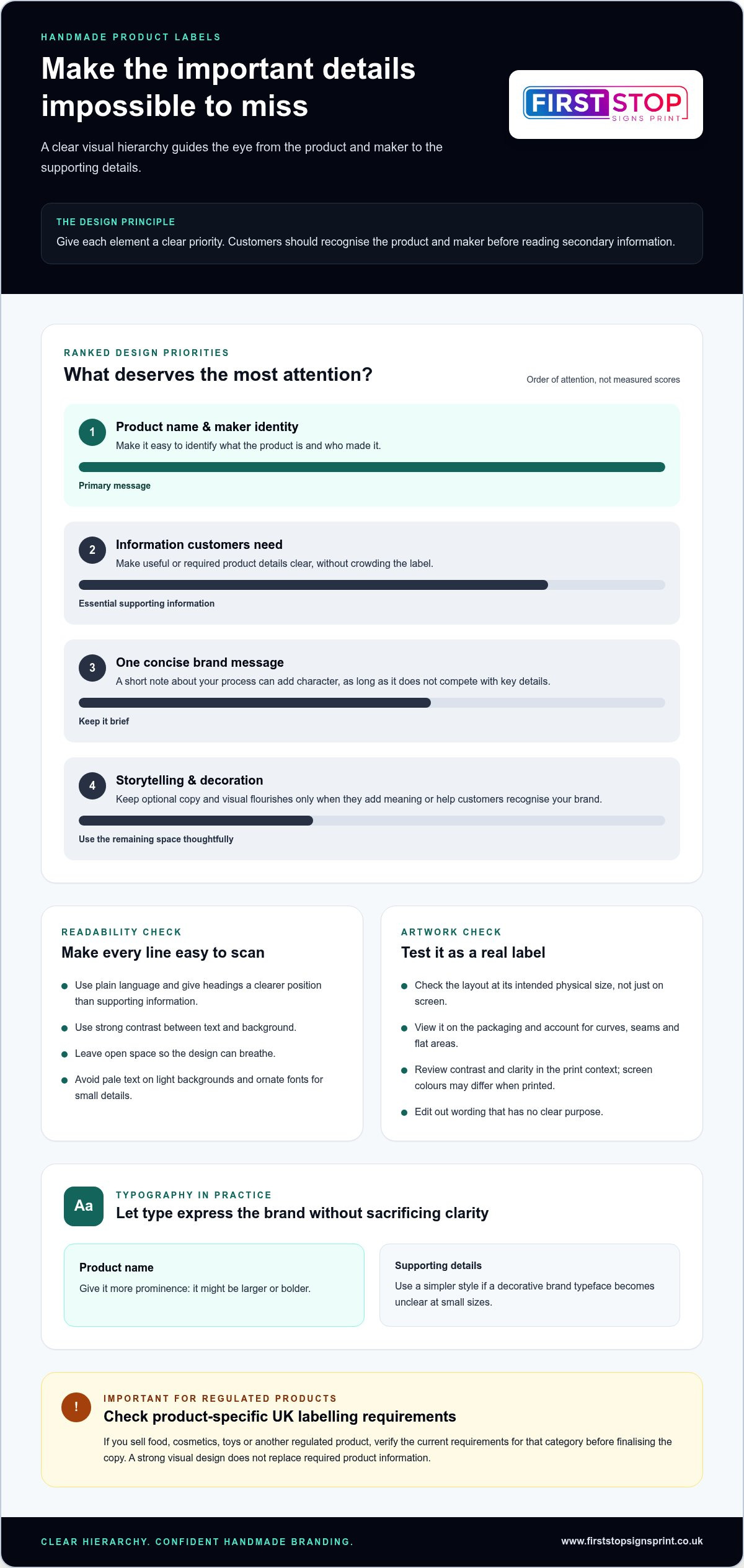
On a small label, every element competes for space. Visual hierarchy gives each one a clear priority, guiding the eye from the main message to supporting details. Visual hierarchy is the order in which label elements attract attention, helping customers recognise the product and maker before reading secondary information.
Start with the product or maker name, then arrange supporting copy so it’s easy to scan. Keep wording concise, use strong contrast between text and background, and leave enough open space for the design to breathe. A logo, colour palette or illustration can bring handmade character, but each should strengthen recognition rather than compete with the main message.
How do you make small label text easy to read?
Use plain language and distinguish headings from supporting information. A product name might be larger or bolder, while details such as contents or a short brand message take a quieter position. Avoid squeezing in copy just because there’s room on screen. Edit until every line has a purpose, then check it at the label’s intended physical size.
Pale text on a light background, low contrast and ornate decorative fonts can all make words difficult to read. If a typeface expresses your brand but becomes unclear at small sizes, reserve it for a short heading and use a simpler style for details.
How can colour and imagery reinforce a handmade brand?
Choose a restrained palette that feels consistent across your products and packaging. A recurring colour or small logo can help customers recognise your work, while an illustration or pattern can suggest an ingredient, material or making process. Keep decorative elements only when they add meaning or recognition. Too many details can crowd the label and weaken its main message.
Screen colours may not look exactly the same when printed, so review the artwork in its print context before approving it. Check that contrast still works and important details remain clear. For UK products, use the UK product labelling law guidance as a starting point, then verify current requirements for your product category. A strong visual design doesn’t replace required product information.
As you refine the layout, test it at actual size and view it on the packaging. When you’re preparing artwork for production, explore label printing and design as the next step from considered layout to a finished physical label.
Compare label shapes, materials and formats for your product
The right label fits the product, packaging and way customers handle it. Before designing labels for handmade products, consider the surface it will go on, how it will be applied and the look you want. Paper can give a natural, tactile impression; film-style materials can offer a different, often smoother visual effect. Neither is automatically right for every product. Moisture, surface texture, friction and storage conditions can all influence the choice, so assess how the label will be used rather than relying on appearance alone.
| Choice | Application | Handling and design implications |
|---|---|---|
| Round or oval shape | Jars, tins and small containers | Can echo a curved package, but leaves less room for long copy. |
| Rectangle or square | Boxes, bags and flat panels | Provides a familiar space for a logo and information; check corners against package seams and edges. |
| Paper material | Packaging where a paper appearance suits the brand | Can support a tactile, natural look. Consider the surface and conditions it will encounter. |
| Film-style material | Packaging where a smoother appearance is preferred | Offers a different finish from paper. Check that the look and feel suit the product and its use. |
| Fabric label | Sewn goods such as clothing or textile accessories | Designed to become part of the item rather than adhere to packaging; allow room for the label to be attached neatly. |
Should you choose a sheet label, roll label or fabric label?
Sheets can suit a maker applying labels individually by hand, while rolls may fit a workflow where labels are dispensed one at a time or applied in a repeated sequence. Think about how you package orders and the quantities you need to handle, rather than choosing a format on appearance alone. Fabric labels are a distinct choice for sewn products. For boxes, jars or bags, an adhesive label is usually the more direct format to consider.
How should the label shape and finish fit the packaging?
Match the outline to the available space and the contours of the package. A wide label may sit neatly on a flat box, while a narrow one may suit a small jar. Matte finishes give a softer, less reflective look; gloss can add visual shine; textured effects bring another tactile element. These are design choices, not a ranking of quality. Cut a paper mock-up to size and place it on the actual packaging before settling the dimensions. Check seams, curves and the space needed for readable copy.
Whatever the format, keep product details accurate and avoid misleading claims. The UK government’s UK product labelling law guidance is a useful reference when preparing label information.
Design and check your handmade product label in five practical steps
A simple workflow helps turn an idea into artwork that fits the packaging and is ready for production. Use these five steps to keep designing labels for handmade products organised, from the initial brief to the final file review.
- Write the brief. Note what the product is, who will read the label, where it will sit and what it needs to communicate. Record the intended label dimensions and practical conditions, such as how the package will be stored or handled.
- Confirm the content. Gather the product name, maker identity and any required product details before laying out the design. Check spelling and accuracy, and separate essential information from optional brand copy so the label doesn’t become crowded.
- Plan the layout. Arrange the information in order of importance. Give the product or maker name clear prominence, then position supporting details and visual elements around it. Leave space at the edges rather than pushing text or a logo right up to the cut line.
- Choose the format. Settle on the label’s shape, material and application format based on the package and how labels will be applied. Make a paper template at the intended physical size and place it on the actual packaging to check proportions, positioning and contours.
- Review the final artwork. Proofread every version, check logo placement and compare label variations for consistency. Inspect the artwork at final size, then prepare the file using the printer’s supplied specifications for resolution, bleed, safe area, file format and colour settings. Requirements can differ by print job, so follow the relevant production guidance rather than assuming one setup suits every label.
What should you check before sending label artwork to print?
Proof the artwork itself, not just a small preview on screen. Confirm product details and spelling, make sure important content sits within the safe area, and check that each variation uses the correct logo and information. Bleed allows artwork to extend beyond the trim edge where required. Follow the printer’s instructions for its dimensions and file setup.
Before print, check the size, legibility and artwork setup.
How can a simple mock-up prevent design mistakes?
Print a paper version at the intended dimensions, or mark out the label shape on paper, then position it on the actual package. Check whether the design is visible from the expected viewing distance and whether text or graphics cross a curve, seam or edge. Look at it under typical display or use conditions before approving the artwork. This practical check can reveal layout issues that are easy to miss on screen.
Once your brief and artwork are ready, take your label design to print with a considered file and clear production requirements.
Turn your label design into professionally printed product packaging
A finished brief, approved artwork and chosen label format give production a clear starting point. Together, they show what the label needs to communicate, how it will fit the packaging and how the design should be prepared for print. This connects the creative decisions made while designing labels for handmade products with the physical label customers will see and handle.
First Stop Signs Print provides label printing and packaging printing, bringing design and production together in a considered process. A label can be produced as a standalone element or planned alongside packaging so the finished presentation feels consistent. The right approach depends on the product, packaging and role the label needs to play.
What information helps move a label design towards print?
Clear project details help align the design with the intended printed result. Prepare a concise handover covering:
- Product and packaging: describe the handmade item and the surface or package the label will sit on.
- Artwork: supply the approved design files and identify any label variations, such as different product names.
- Format and dimensions: state the chosen label shape, material or application format, along with the final dimensions.
- Production specifications: include any file, colour or artwork setup requirements already supplied for the print job.
Before handover, make sure the approved artwork matches the final copy and intended label version. Clear details reduce ambiguity between design and production, helping the finished print reflect the planned layout and packaging needs.
How can a consistent label support a growing handmade brand?
As a product range expands, keep core elements such as the logo, typography and colour choices consistent. Then make each label variation easy to distinguish through clear product names and purposeful changes to supporting details. This gives related products a recognisable family look without making customers work to tell them apart. A consistent visual approach can also carry through to packaging for a cohesive presentation.
When your design and format are ready, explore label printing for handmade products to take your product label from considered artwork to print.
Bring your handmade label from concept to print
A well-planned label does more than decorate a package. It helps customers identify your product and maker, communicates key information and gives your brand a consistent presence. The most reliable designs begin with the product and its packaging, then use a clear visual hierarchy, a suitable format and concise, legible copy.
Before approving artwork, check it at its finished size and test a physical mock-up on the actual packaging. Review the wording, colours and layout, then prepare the files to the print specifications for the job. These practical checks help you move from designing labels for handmade products on screen to artwork that’s ready for production.
First Stop Signs Print provides label printing and packaging printing, bringing design and production together in one process. Whether you’re preparing a label for one product or building a consistent look across a handmade range, a clear brief and approved artwork are a strong place to start.
Explore label printing for your handmade products and take the next step towards a distinctive, print-ready label. Your product deserves a presentation that feels as considered as the work behind it.
Frequently Asked Questions
How do I design labels for handmade products?
Start with the product, its packaging and the person who will read the label. Decide which information customers need, then make the product or maker name the first thing they notice. Choose a shape and material that suit the packaging, and keep the wording and artwork clear at the finished size. Before printing, place a physical-size mock-up on the package and check the final artwork against the printer’s specifications.
What should I put on a label for a handmade product?
Include the product or maker name and the details customers need to identify or understand the item. A short brand message can add personality if space allows, but it shouldn’t crowd essential information. What’s needed varies with the product category and how it’s sold. If your item is regulated, check the current UK requirements for that specific category before finalising the wording. Don’t assume one checklist applies to every handmade product.
Which material is best for handmade product labels?
No single material is best for every handmade product. Consider the packaging surface, how customers will handle the item, where it will be displayed or stored, and the appearance you want. Paper can create a natural, tactile look, while other label materials may suit particular packaging or finishes. Fabric labels are a separate option for sewn goods. Test a sample or mock-up on the actual product before settling on your choice.
How do I make a label design look professional?
Keep the layout organised, use consistent brand colours and make the product or maker name easy to spot. Choose type that remains readable at the label’s finished size, with enough contrast between text and background. Resist filling every available space with copy or decoration. Review the design at actual size, not just on screen, then use a mock-up to check how it sits on the package and looks in context.
Can I print labels for handmade products at home?
Home printing can suit some projects, depending on your printer, compatible label stock and the finish you need. Check that the stock is suitable for your printer, then test a label for colour, alignment and readability before printing a batch. For larger runs or a consistent professionally produced appearance, commercial label printing may be a practical option. Prepare the artwork to the production specifications so the design is ready for print.
What file format should I use for printed product labels?
Use the file format and artwork setup specified for the print job, as requirements can vary. Before sending the file, check the final dimensions, image quality, colour settings, bleed and safe area against the supplied guidance. Proofread every line and inspect the design at actual size. If production includes a template or artwork guide, use it to position the design correctly and help avoid preventable changes before printing.


