
Office branding solutions in London connect a company’s identity with the colours, logos and signage people see throughout its workplace. In a large open-plan office, coordinated visual cues can distinguish spaces for collaboration, focused work and relaxation. In a smaller office, a well-placed focal point makes the brand visible without overwhelming the room.
A consistent office look can make a positive impression on visiting clients, while thoughtful internal branding can help employees feel connected to the organisation and its values. The challenge is to bring those ideas into the physical space in a clear, practical way, rather than simply adding decoration.
This guide explains how office branding connects identity with signage, what to consider for different office sizes, and how elements such as wall graphics, dimensional lettering and wayfinding can work together. You’ll also learn which decisions shape a branding project, helping you plan a workplace that reflects your company and works for the people who use it.
Key Takeaways
- Align colours, logos and signage with your company’s identity to create a consistent impression for visitors and employees.
- Plan signage around where people need to see information, from entrances and reception areas to shared spaces.
- In open-plan offices, use visual cues to distinguish collaboration, focused-work and relaxation zones.
- In smaller workspaces, choose a clear focal point and make each branded element earn its place.
- Compare agencies by the relevance of their portfolios and the practical fit of their proposed signage and finishes.
Office branding and company identity
Office branding connects a company’s identity to the signs, graphics and visual details people encounter at work. Start with the brand strategy, then translate it into choices that suit the space and its users.
Choosing an Agency in London
How do I choose an office branding company in London? Compare portfolios for projects similar to your space, such as reception lettering or graphics across an open-plan floor. Read reviews for details about communication, installation and finish, then ask how the proposed design will carry your existing identity into the workplace.
Look for a clear process: understanding the brief, planning artwork, agreeing materials and coordinating installation. For office branding solutions in London, a relevant portfolio matters more than unrelated examples. Check that projects show signs in context, so you can judge scale, visibility and how the palette works with the room.
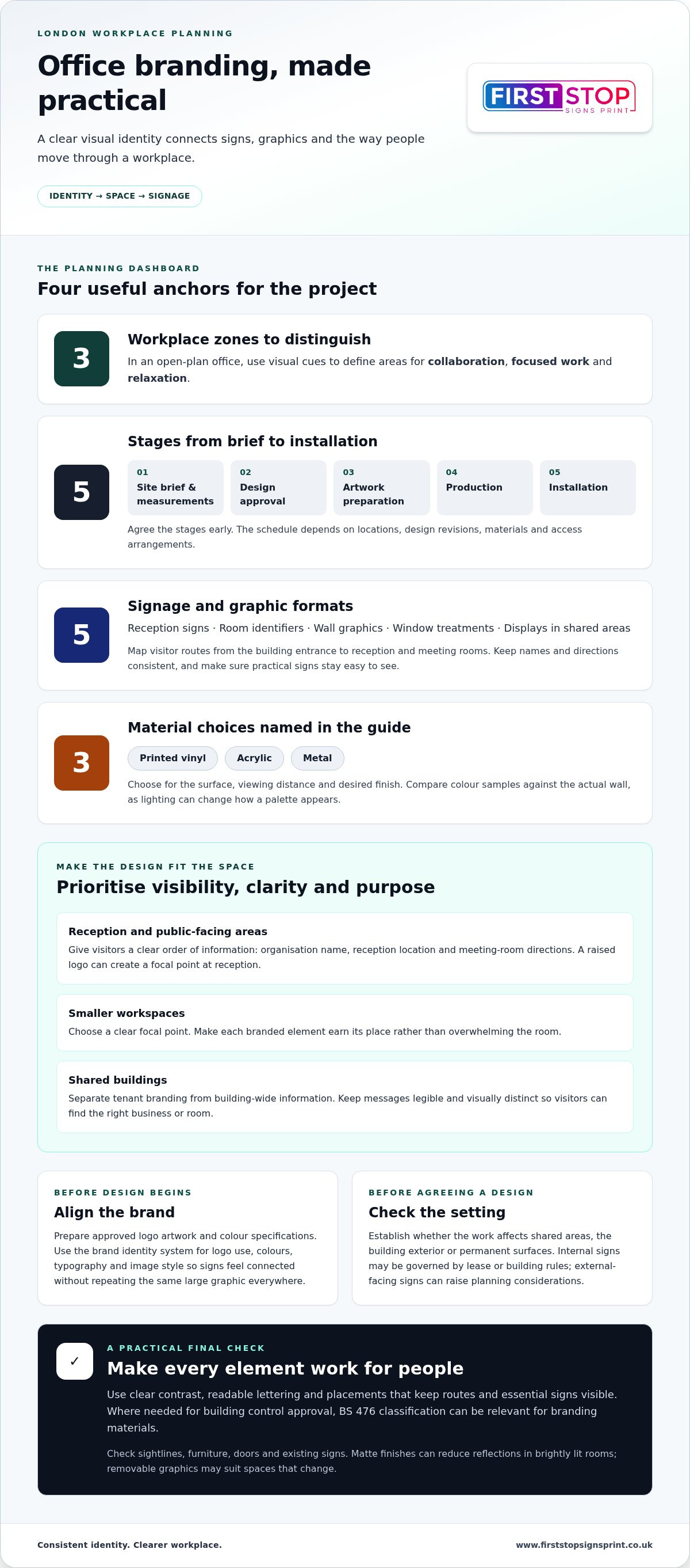
A brand identity system helps separate elements feel connected. It can define logo use, colours, typography and image style, giving designers a consistent reference for reception signs, meeting-room graphics and wayfinding. Prepare approved logo artwork and colour specifications before design begins. For example, a consistent palette can link a reception mark with smaller room labels without repeating the same large graphic everywhere.
Do office signs and graphics in London need planning permission or landlord approval? Internal signs and wall graphics may be governed by the lease or building rules, while external-facing signs can raise planning considerations. Establish whether the work affects shared areas, the building exterior or permanent surfaces before agreeing on a design.
How can office branding meet accessibility and fire safety requirements in the UK? Use clear contrast, readable lettering and placements that keep routes and essential signs visible. For fire safety, BS 476 classification can be relevant for branding materials where needed for building control approval.
What is the process and timeline for an office branding project? It typically moves from a site brief and measurements to design approval, artwork preparation, production and installation. The schedule depends on the number of locations, design revisions, material choices and access arrangements, so agree on these stages before work starts.
Materials and Finishes
What materials and finishes are used for office wall graphics and signage? Wall graphics commonly use printed vinyl, while dimensional signs can use materials such as acrylic or metal. The right choice depends on the surface, viewing distance, desired finish and whether the sign needs depth or illumination. Compare colour samples against the actual wall, as lighting can change how a palette appears.
Matte finishes can reduce reflections in brightly lit rooms, while a raised logo can create a stronger focal point at reception. Match the fixing method to the wall and intended permanence, and plan installation around furniture, doors and existing signs.
What sustainable office branding materials and installation options are available in London? Consider removable graphics where a workspace may change, and choose durable elements that can remain useful through layout updates. Locally sourced furniture and décor can help reduce a company’s carbon footprint. A clear materials plan also helps avoid unnecessary replacements when the office is reorganised.
Public advertising, branding and signage sites
Office signage and branded interiors can make a workplace easier to recognise and navigate. Common options include reception signs, room identifiers, wall graphics, window treatments and displays in shared areas.
Office Signage and Wall Graphics
Start by mapping the places visitors encounter, from the building entrance to reception and meeting rooms. A reception sign can establish the organisation’s identity, while directional signs guide guests to specific spaces. Wall graphics can add visual context in a waiting area or corridor through a brand message, colour or image.
Consider viewing distance and sightlines before choosing size or placement. For example, a sign behind a reception desk needs to remain visible above furniture, while a corridor graphic should not compete with room identifiers. Keep names and directions consistent across each floor, so visitors see the same terminology at the entrance and destination.
Branded Interior Options
Branded interiors extend the visual identity beyond standalone signs. Decorative panels, framed graphics and carefully placed artwork can bring colour into meeting rooms, breakout areas or shared reception spaces. Select a few focal points, such as a feature wall and a branded meeting-room panel, rather than covering every surface.
In shared buildings, distinguish tenant branding from building-wide information. A tenant logo can identify a company at its reception, while a building directory serves several organisations. Keep each message legible and visually separate, particularly where visitors need to find a specific business or room.
Public-facing spaces need a clear visual order. Prioritise the information visitors need first, such as the organisation name, reception location and meeting-room direction. Supporting graphics can reinforce the brand, but shouldn’t obscure practical signs or create competing messages.
Digital screens can show changing branded content without physically altering a wall. Static graphics suit messages that remain relevant, such as a company value or permanent room name. Choose between them by considering how often information changes and whether the display belongs in a lobby, corridor or meeting space.
Build the layout around the routes people actually use. Mark the entrance, reception desk, lifts, shared facilities and meeting rooms on a simple floor plan. Then place each sign where a visitor needs to make a decision, rather than repeating the same visual across every wall.
Review the design at eye level and along the approach route. A floor plan may show an available wall, but a doorway, furniture or change in corridor direction can affect visibility. A site walk-through helps identify these details before production.
Where physical signs need fitting at reception or in shared areas, professional sign installation can help bring the approved layout into the finished space.
Branding large open-plan offices
In a large open-plan office, branding needs to organise the space as well as express company values. Colour, furnishings and graphics can help distinguish collaborative areas, focused workstations and places to pause.
How do office branding solutions compare for small offices, coworking spaces and large workplaces? Small offices benefit from a few considered focal points, while coworking spaces need clear, adaptable identity cues. Large workplaces can use coordinated palettes and furnishings to give distinct zones a shared visual language.
Begin with a floor plan showing entrances, desks, meeting rooms and shared facilities. Mark where employees and visitors pause, choose a route or need to identify a zone. This turns branding into a practical layout exercise. For example, a coloured feature behind a collaboration area can distinguish it from nearby individual workstations.
Use colour with purpose. A consistent palette can connect separate departments, while different accent colours can signal changes in activity. Pair those visual cues with furnishings: a shared table and informal seating can define a collaboration zone, while quieter desk areas retain a simpler treatment. Keep the company’s core identity recognisable throughout.
Large walls offer room for graphics, but scale and sightlines matter. A logo or values statement may work well at a main entrance, where people can take it in. Smaller graphics can support a particular zone without competing with practical information. Check how the design looks from the doorway, main circulation route and seated positions.
Plan production around the approved layout. Record wall dimensions, surface conditions, furniture positions and access routes before preparing artwork. Then review colour proofs and sign placement in context. This sequence helps catch issues such as a graphic hidden behind a screen or a message interrupted by a doorway.
For a London workplace, begin by identifying how teams use each part of the open-plan floor. A shared project table may need a distinct visual cue, while quiet desk areas benefit from less prominent graphics. This grounds the design in daily activity and gives each visual treatment a clear purpose.
Plan for change, too. Teams move, desks are rearranged and departments may use spaces differently over time. Choose a visual system that accommodates those shifts, such as repeated colour cues or modular graphic placements. Keep essential wayfinding distinct, so a revised layout does not leave visitors following outdated directions.
Before installation, review the proposed design with people who use different parts of the office. Ask a visitor to follow the route from entrance to meeting room, then ask an employee to find the collaboration area. Their paths reveal whether the branding guides people clearly, supports daily work and keeps the wider identity consistent.
A clear hierarchy of colour palettes and furnishings can define zones and distinguish areas for collaboration, focused tasks and relaxation. First Stop Signs Print regularly delivers professional office branding solutions london businesses rely on, supporting a coherent workplace identity in daily use.
Branding small offices
In a compact office, each branded feature competes for limited wall and floor space. Choose a clear focal point, such as a brand-coloured accent wall behind reception. This makes the corporate identity visible without filling every surface. Before choosing graphics, map the entrance, desks, windows and meeting area. This simple step shows where branding can be seen without obstructing work.
Use vertical surfaces to create impact while keeping desks clear. A logo on one wall can anchor the room, while a small set of matching graphics carries the palette into a meeting corner. Keep text brief and legible at the intended viewing distance. For example, a short values statement beside a collaboration table can add character without becoming a second focal point.
A branded collaboration zone can encourage idea-sharing in a small footprint. Use one wall for motivational posters or a concise prompt, then arrange seating to distinguish the area from individual workstations. Keep routes between desks and doors clear. If the room serves several functions, a movable screen or decorative panel can mark the zone without creating a permanent partition.
Rented and serviced offices need a flexible approach. Providers may restrict permanent changes, including painting or signs in communal spaces. Removable wall or window decals can add identity without lasting alteration, while freestanding branded panels can move with the business. Check the lease and building rules before planning fixed graphics, especially in shared reception areas.
Small offices can also use windows as branding surfaces. A discreet graphic can identify a room or add privacy while preserving clear views where staff need them. Plan placement around glazing, door swings and sightlines from outside. If the team relocates, removable treatments can simplify setting up the next workspace.
Make existing furniture part of the visual scheme. Reupholstering chairs in a brand colour can refresh a meeting corner without replacing the furniture. Repeat that colour on a noticeboard edge or in a small wall graphic for continuity. Keep the rest of the palette restrained, so the accent stays distinctive rather than making the room feel crowded.
Before production, test the design with a paper layout or digital mock-up. Mark the proposed logo, accent wall and any window graphics against photographs of the actual room. Review them from the doorway and seated positions. This practical check helps identify competing messages, awkward placements and surfaces that need to stay clear.
Prioritise the elements people notice first: the entrance, reception point and main meeting space. A small office rarely needs branding on every wall. A consistent focal point, a useful collaboration area and carefully placed identity cues can make the space feel considered while preserving room for daily work.
Which London office branding agencies have strong reviews and portfolios?
Look for evidence that a company can connect brand identity with practical workplace signage. Reviews and portfolios are useful when they show relevant office projects, explain the work involved and describe how the finished space functions. A polished image alone says little about design decisions, installation or whether staff and visitors can use the space easily.
Start with the portfolio. Check for examples of reception areas, meeting rooms, open-plan floors and smaller offices. Look for photographs showing signs in context, rather than isolated logo artwork. A strong case study should explain the brief, chosen materials and how the design supports the organisation’s identity. For example, a reception sign should be visible from the entrance, not just attractive in a close-up.
Read reviews for details about the working process. Comments on communication, artwork approval, site coordination and installation offer more insight than general praise. Look for recurring, specific observations across different projects. A review describing how a team handled a complex office layout is more relevant than an unrelated comment about another type of work.
Use these checks to compare portfolios and feedback:
- Confirm that examples show workplaces similar to yours in layout and use.
- Look for finished installations, not only digital concepts or product photographs.
- Check whether the design balances brand visibility with clear wayfinding.
- Read reviews for concrete descriptions of planning, communication and finish.
- See whether projects show consistent identity across several rooms or areas.
Then assess how the company translates a brief into a workable plan. A useful proposal should identify the intended audience, priority locations and purpose of each sign. For instance, reception branding introduces the organisation, while room identifiers help visitors reach the right meeting space. This distinction prevents decorative elements from distracting from essential information.
Ask how artwork moves from approval into production and installation. Clear stages make it easier to understand when you’ll review layouts, confirm materials and prepare the site. For a multi-room office, a location schedule can record each sign, its message and position. That gives the project team a practical reference during fitting and helps maintain consistency.
Finally, compare the portfolio against your own requirements, not an agency’s general reputation. A compact office may need a focused wall treatment and a reception mark; a larger floor may need coordinated signs across several zones. Choose evidence that matches the scale, finish and function you need. To discuss signage for your workplace, request a project conversation.
Prioritise companies whose portfolios show completed office projects with signage in context, consistent branding across rooms and clear wayfinding. Strong reviews describe specific strengths in communication, planning, site coordination and installation.
First Stop Signs Print: Label Printing
First Stop Signs Print can help bring your office identity into view through practical printed and visual elements. Its label printing suits businesses that want branded labels for workplace items, while custom business signs can identify reception areas or rooms. For feature walls, 3D wall panels and metal wall art add a distinct visual element to the space.
Consider these options when planning a new office layout, refreshing reception or adding consistent branding across different areas. Matching each item to its purpose helps create a considered environment without adding unnecessary graphics.
To discuss signage and printed graphics for your office, contact First Stop Signs Print.
Turn your office identity into a clear plan
Give your next workplace project a practical starting point: choose the area where a clearer identity would make the biggest difference, then decide what visitors or staff should notice there. This keeps design choices focused on how the office is used, rather than adding graphics without a purpose.
For office branding solutions in London, the next step is to match that priority with suitable physical elements. First Stop Signs Print offers Label Printing, Custom Business Signs and 3D Wall Panels, helping businesses shape their visual presence through printed details and features for the workplace.
Bring your ideas together before production by noting the location, intended message and existing brand artwork. That gives the conversation a clear direction, whether you’re refreshing one area or planning a broader change.
Contact First Stop Signs Print to discuss your office branding requirements. A well-planned workplace identity can begin with one considered choice, and build from there.
Frequently Asked Questions
What is Office Space Branding?
Office space branding applies a company’s visual identity to its physical workplace. It can include branded reception details, room identifiers, printed graphics and decorative features. For example, a meeting room might use a company colour and a discreet identity mark, while its door sign displays the room name. The aim is to make the workplace recognisable and coherent while keeping signs useful for the people who work there or visit.
What office branding solutions do London companies offer?
London providers offer a range of printed and physical options, depending on the project. These can include custom business signs, labels, large-format prints, wall features and installed signage. First Stop Signs Print offers Label Printing, Custom Business Signs and 3D Wall Panels, alongside Metal Wall Art. A business might use a sign to identify its reception, then add a panel or artwork to give a shared workspace a more distinctive appearance.


