
A pub sign should be easy to recognise and feel right for the venue. Pub signs in London can be custom-designed, themed around the city, traditional in style or made for outdoor hanging. The format and artwork can be shaped around the pub or bar, helping its name and character stand out.
Choosing a design involves more than picking an image. The sign’s position, surroundings, style and visibility all affect how it works on the building. A traditional motif may suit a historic frontage, while a distinctive custom design can give a newer bar a stronger sense of identity.
This guide covers the main design options, practical considerations for outdoor signs and ways London’s pub-sign heritage can inspire a contemporary look. It also explains how materials, installation and design choices shape a bespoke sign, helping you plan an option suited to your venue and its setting.
Key Takeaways
- Match the sign’s shape, artwork and finish to your pub’s identity and the character of its frontage.
- Use recognisable London references thoughtfully to give a custom design a strong sense of place.
- Traditional motifs can draw on centuries of British pub-sign history while still feeling distinctive to your venue.
- Explore historic examples around London for inspiration, then consider how position and upkeep affect an outdoor sign.
- Custom Business Signs from First Stop Signs Print can help venues create a distinctive visual presence tailored to their brand.
Custom pub sign designs
A custom sign can make a pub recognisable before customers reach the door. London examples show how a clear concept can become distinctive artwork. The Famous Three Kings in West Kensington displays an Elvis Presley pub sign, while The Pig’s Ear in Chelsea features a porcine pastiche of Toulouse-Lautrec. Both show how a venue’s identity can guide its imagery.
Start with the story the sign should tell. Note the pub’s name, history and the atmosphere it wants to create. Then choose one central image rather than crowding the design with unrelated ideas. Elvis Presley suits the Famous Three Kings’ name; a pig caricature gives the Pig’s Ear a memorable visual link.
Next, decide what customers should read first. Usually, the pub name needs the strongest visual emphasis, while supporting wording, dates or a short strapline stay secondary. Sketch the sign at its intended proportions and review the lettering alongside the image. A layout that looks balanced on screen may feel crowded at full size.
Consider how people will see the sign. A hanging sign may be viewed from the pavement, at an angle or against busy shopfronts. Keep the main image and lettering recognisable from these viewpoints. Check the building’s colours and nearby details, too. Strong contrast helps the sign stand out while still feeling connected to its surroundings.
Shape and illustration can convey as much character as the wording. A pub with a historical theme might use a traditional-looking crest; a modern bar could favour a simpler graphic. The Pig’s Ear’s Toulouse-Lautrec-inspired figure shows how an artistic reference can be adapted to a venue’s name. Avoid copying another pub’s complete design.
Before finalising the artwork, gather practical details for the designer: the exact pub name and spelling, image references and the sign’s intended position. Add a photograph of the frontage if available. Check that important details will be legible at the planned viewing distance. This review can catch layout problems before production.
Colour choices should support legibility and the venue’s character. Select a small, coherent palette, then check how the name and illustration work together. A detailed caricature, for example, may call for simpler lettering nearby, while a minimal symbol can make room for more expressive type. The design should make sense at a glance.
Before approving the artwork, check it against the brief. Verify the pub name, illustration, colours and proportions, then review the proposed placement. For custom pub signs in London, these decisions connect a venue’s story with a distinctive, visible frontage. The result should feel specific to the pub, not like a generic template.
London-themed pub signs
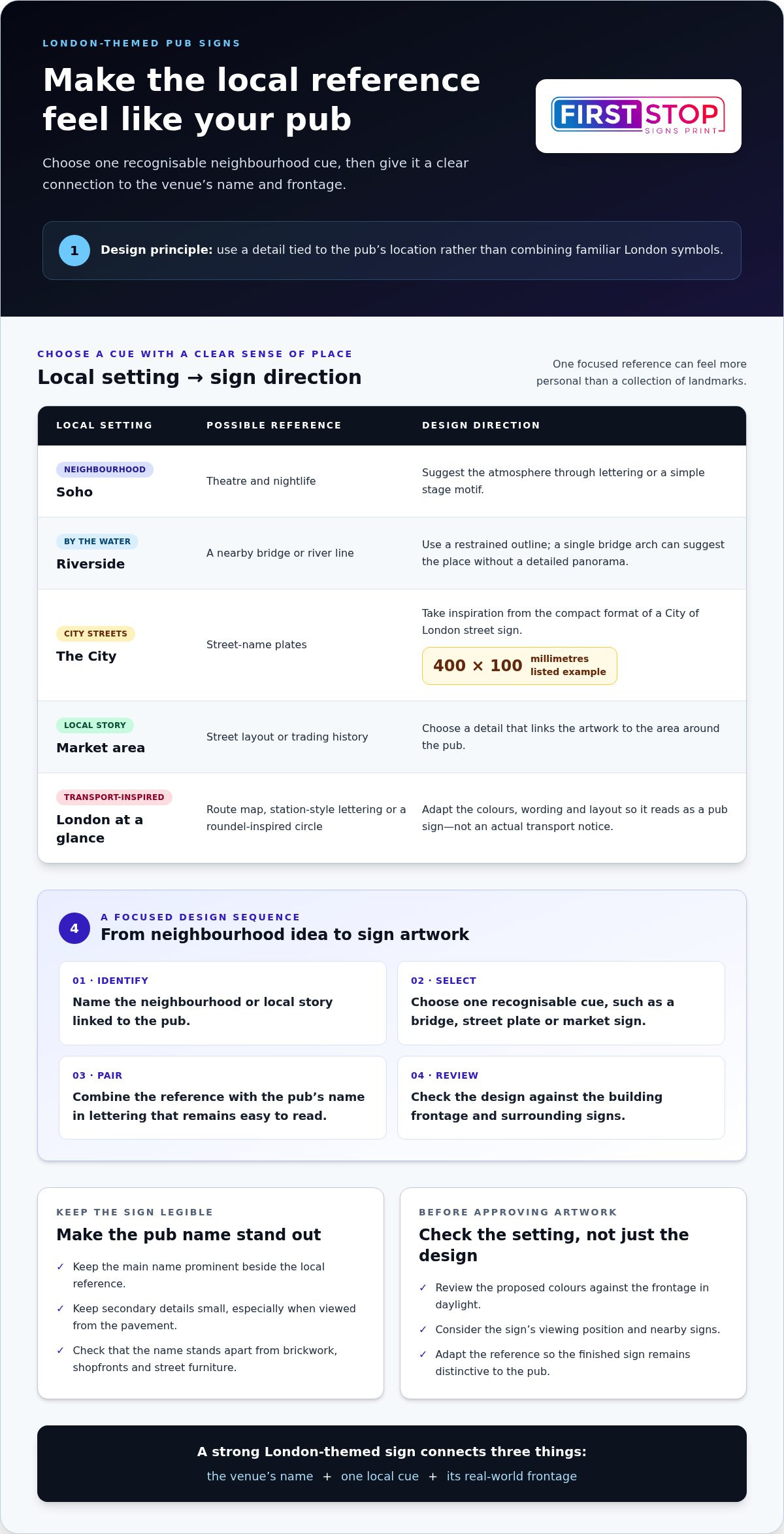
A London theme can give a pub sign a strong local identity. Start with a detail tied to the venue, rather than combining familiar symbols. A pub near the Thames might use a river line or bridge silhouette; a venue by a market could draw on its street layout or trading history. These cues feel more personal than a collection of landmarks.
Consider which part of London the pub wants to represent. A design for Soho could suggest theatre and nightlife through lettering or a simple stage motif. A riverside bar might use a restrained outline of a nearby bridge. A pub in the City could take inspiration from street-name plates. One City of London street sign is listed at 400 by 100 millimetres, a compact format that shows how limited space can still carry a clear place reference.
Choose the reference before settling on the artwork. A useful design process is:
- Identify the neighbourhood or local story linked to the pub.
- Select one recognisable visual cue, such as a bridge, street plate or market sign.
- Pair that image with the pub’s name in lettering that remains easy to read.
- Review the design against the building’s frontage and surrounding signs.
This sequence keeps the London influence focused and helps the sign remain recognisable as the pub’s own.
Transport imagery can suggest London at a glance. A route map, station-style lettering or a roundel-inspired circle may provide a starting point. Treat these as broad visual references, then adapt the colours, wording and layout. The sign should not be mistaken for an actual transport notice. Keeping the pub name prominent makes its purpose clear.
Local landmarks also offer options beyond the usual skyline. Consider a distinctive bridge, a riverside detail, a market canopy or a recognisable street corner. A line drawing can capture the shape without overcrowding the sign. For example, a single arch can suggest a bridge more cleanly than a detailed city panorama. Keep secondary details small, especially where the sign will be viewed from the pavement.
Colour and lettering can carry a sense of place, too. Red, blue or cream may echo local architectural details, whilst a classic serif can suggest heritage. These choices work best when they support the pub’s existing identity. Compare proposed colours with the frontage in daylight, then check that the pub name stands apart from brickwork, shopfronts and nearby street furniture.
For a cohesive result, bring together the venue’s name, neighbourhood reference and viewing position before approving artwork. A London-themed sign should feel connected to its surroundings, yet distinctive to its own pub. Explore visual sign ideas as you develop a design direction.
Traditional pub signs
Traditional pub signs have identified English drinking houses for centuries. In 1393, King Richard II made signs compulsory for pubs and inns. They helped the official Ale Taster recognise each premises. That history gives traditional imagery a practical beginning, as well as a visual one. A heritage-inspired design can draw on this history without copying an existing sign.
Early British pubs displayed long poles, sometimes called ale stakes, outside their doors. These may have been used to stir ale. Over time, signs developed into recognisable pictures and symbols. A modern design can nod to the pole with an elongated shape, creating a historical reference without needing a detailed scene.
Religious imagery once appeared on many British pub signs. Before Henry VIII’s break with the Catholic Church, signs often used religious themes. Afterwards, pub names and images shifted towards royal and national symbols. The King’s Head and The Rose & Crown show how these themes entered pub identity. A sign based on either name could use a crown, rose or portrait-style motif.
Royal emblems offer another traditional direction. James I and VI of Scotland ordered the heraldic red lion of Scotland to be displayed on important buildings, including pubs. Many White Lion inns date from Edward IV’s time, while the White Boar was Richard III’s emblem. These examples show how colour, animal imagery and heraldry can make a sign’s meaning legible.
Historical figures also provide established sign themes. British pubs have been named after people such as the Duke of Wellington and Shakespeare. A traditional design can use a portrait, symbolic object or restrained coat of arms. Choose imagery that clearly connects to the pub’s name. Unrelated historical details can make the sign harder to understand.
For a new traditional-style sign, work through these choices:
- Start with the pub’s name and its meaning.
- Select one motif, such as a red lion or white hart.
- Choose lettering that suits the intended historical character.
- Keep the main image distinct from supporting wording.
Common English motifs include red lions, white harts and coats of arms, each offering a different visual balance. A lion can create a bold central image; a coat of arms can organise several symbols; a white hart gives the design a recognisable animal figure. Use one dominant motif to keep the sign clear at street level.
Traditional doesn’t have to mean unchanged. The Angel and Crown in London includes a quotation from Psalm 91:11 on its sign. That example combines a familiar pub name with a specific textual reference. A contemporary venue can take a similar approach by pairing established imagery with a detail meaningful to its own story. Keep the wording concise, and let the motif remain the sign’s focus.
Where can I see historic pub signs in London?
Historic pub signs can be found across London, from central alleys to neighbourhood streets. Start with the Shakespeare, whose signage says it was first constructed in 1735. The wording offers a direct connection between the pub and its past. Look closely at how the date and name work together, rather than viewing the sign as decoration alone.
In Hammersmith, the Chancellors has a shield sign with an unusual detail: two Tudor gentlemen point towards Einstein’s famous equation of energy-mass equivalence. The image combines historical dress with a modern scientific reference. Notice how the shield frames the scene, separating its central illustration from the pub’s surroundings. It is a sign that rewards a closer look.
The Marquess of Anglesey has been a London pub under different names since 1663. That long naming history makes it a useful place to consider how a pub’s identity can change over time. Compare the pub’s current name with its historic setting. Observe which parts of the sign communicate the venue’s identity most clearly from the street.
For a different setting, find Ye Olde Mitre down an alleyway off Hatton Garden. Its tucked-away position makes the approach part of the experience. Notice how a sign works in a narrow passage, where sightlines differ from those of an open frontage. The entrance, surrounding buildings and viewing angle all affect how visitors encounter a pub sign.
To make a visit useful for your own design planning, record specific details at each stop:
- Write down the pub’s name and the sign’s main image.
- Note whether the sign uses a shield, lettering, illustration or date.
- Observe how far away the sign remains recognisable.
- Compare its position with nearby doors, windows and street features.
These observations help distinguish the sign’s visual idea from its location. The Chancellors’ shield, for instance, offers a clear frame; Ye Olde Mitre shows how an alleyway affects visibility.
Keep the examples distinct. The Shakespeare’s construction date, the Marquess of Anglesey’s changing names and the Chancellors’ unusual illustration each offer different inspiration. One points to recorded history, another to an evolving identity, and the third to a visual story. These references give a designer useful starting points without copying a complete sign.
Historic pubs also show why context matters. A sign above a busy street may need a different visual emphasis from one in an alley. At Ye Olde Mitre, consider the approach; at the Chancellors, study the shield’s composition. London’s historic signs offer practical lessons in legibility, placement and storytelling, as well as distinctive details to remember.
How are London pub signs made and maintained?
A pub sign starts with a brief, then moves through design, production and fitting. For a London venue, the frontage and viewing angle shape each decision. A sign above a narrow pavement needs a clear outline; one viewed across a square can carry finer detail. Begin by noting the pub name, preferred image and intended position.
Next, prepare the design for its final shape and size, considering lettering, colour and illustration together. A detailed image, such as a Tudor figure, may need simpler wording around it. A short pub name can leave room for a larger central motif. Reviewing the artwork at its intended proportions helps reveal crowded layouts before production.
Material choice affects appearance, weight and care. Timber can suit a traditional painted design; metal can provide a crisp finish, while acrylic can create a smooth surface for printed artwork. These options are not interchangeable. Exposure, dimensions, mounting method and the building’s character all influence the choice. The finished sign should suit its setting as well as its artwork.
Production follows the approved design. Depending on the construction, a sign may be cut, printed, painted or assembled from shaped components. Lettering and images are then applied or formed on the face. A simple crest, for example, may need fewer production stages than a layered, three-dimensional illustration. The process should suit the design and material.
Before fitting, consider how a hanging sign relates to the building. The bracket, chain or other support affects its position and movement. A sign above a doorway needs a different arrangement from one fixed to a wall. Installation planning should account for the frontage, sightline and surrounding features. A clear view from the pavement helps keep the pub name recognisable.
Regular visual checks can help identify wear early. Look for faded lettering, cracked surfaces, loose-looking fittings or visible corrosion. From a safe position, inspect the sign face, edges, bracket and chains. After poor weather, check for changes in alignment or surface condition. Record damage so that repairs address the cause, not just its appearance.
Cleaning depends on the sign’s material and finish. Use a suitable method for painted timber, metal or acrylic, and avoid abrasive tools that could mark the surface. Remove dirt gently to keep the artwork legible. If the sign includes lighting, check its visible components as part of routine maintenance. A consistent record makes changes easier to spot over time.
- Agree the artwork and proportions before production.
- Choose materials to suit the design and exposure.
- Plan the fixing around the frontage and viewing angle.
- Inspect the surface and fittings, then clean appropriately.
Planning a sign for your pub? Discuss a custom pub sign that suits your frontage and design.
First Stop Signs Print: Label Printing
First Stop Signs Print helps venues bring their visual identity into the physical space with Custom Business Signs. For a pub planning new frontage signage, this is a natural next step after choosing the name, artwork and style. A considered design can connect the sign with the venue’s character and surroundings.
Label Printing serves a different purpose, supporting venues that need printed labels alongside their wider identity. For a pub sign project, focus on the sign itself and the details that shape its appearance, such as wording, imagery and placement. First Stop Signs Print also offers 3D Wall Panels and Metal Wall Art for other visual applications within a venue.
Contact First Stop Signs Print to discuss a custom sign for your pub.
Give your pub’s identity a clear next step
A sign can be the starting point for a more coherent venue identity. Consider how its lettering, colours and visual character could connect with the experience inside, from the entrance to the spaces guests notice first. This joined-up approach helps a distinctive sign feel like part of the pub, rather than an isolated feature.
If you’re planning pub signs in London, turn your preferred direction into a practical design brief. Note the pub’s name, the story or local reference you want to express, and where people will see the sign. Clear priorities make it easier to shape a design suited to your venue and frontage.
First Stop Signs Print offers Custom Business Signs, alongside Label Printing and 3D Wall Panels. For a sign project, its custom signage work is the relevant next step. Share the direction you have in mind and discuss how it could take shape for your venue.
Contact First Stop Signs Print to start a conversation about your pub sign. A thoughtful brief can help turn your idea into a distinctive part of your venue.
Frequently Asked Questions
What do traditional London pub signs mean?
Traditional London pub signs often use imagery to identify a pub’s name, history or associations; there is no single universal code. A railway motif can suggest transport and industrial change, while a sporting name may reflect a pastime. Read the wording alongside the picture and its setting. Together, these details offer clues, as similar symbols can mean different things at different venues.
Can you buy traditional pub signs in London, and how much do they cost?
Yes, you can commission or buy a traditional-style pub sign in London. The price depends on the dimensions, materials, artwork complexity, finish and hanging requirements. First Stop Signs Print calculates the price after reviewing the artwork and measurements, so request a price with those details. A painted nameplate and an illustrated hanging sign involve different production choices, so compare proposals by their specifications as well as their appearance.
Are London pub signs linked to local history or landmarks?
Yes. Some signs draw on local people, buildings or stories, rather than famous landmarks alone. The Fountains Abbey on Praed Street is associated with a story linking mould spores from the pub to Alexander Fleming’s discovery of penicillin in 1928. Such a local narrative can inspire a sign’s image or wording. A venue could also use a nearby street, market or historic building as a place-specific reference.
What are the most famous pub signs in London?
Notable London examples include the Famous Three Kings’ Elvis Presley sign, the Pig’s Ear’s Toulouse-Lautrec-inspired pig, and the Angel and Crown sign with a quotation from Psalm 91:11.


