
An attractive sign only works if clients can recognise your salon from the street and understand the space once they’re inside. For beauty salon signage in London, pair a clear shop-front sign with a distinctive logo or 3D lettering, then carry the visual style into reception and treatment rooms. Pink, white and warm white are popular choices for salon neon signs, while readable lettering and good contrast help keep the message clear.
Your signage should feel like part of the salon, not an afterthought. The right style can express your brand at the entrance, create a welcoming first impression at reception and make treatment areas feel considered without distracting from their purpose.
This guide explains how to choose between sign styles, select fonts and colours that suit your identity, and plan where each sign goes. You’ll also learn which practical details to include in your signage brief, so the finished scheme feels cohesive and works throughout your space.
Key Takeaways
- Choose clear, legible lettering and colours that suit your salon’s identity; pink, white and warm white are popular options for neon signs.
- Match the sign style to its job, from a visible shop-front board to dimensional lettering or an illuminated feature inside.
- Give reception and treatment rooms different roles: use your salon name or logo to welcome clients, and keep room signage simple and useful.
- Plan the full signage scheme around visibility, the space available and how each area is used, so the elements feel cohesive rather than competing.
- For bespoke signs and interior features, First Stop Signs Print offers Custom Business Signs, 3D Wall Panels and Metal Wall Art.
Choice of fonts and colours
Pink, white and warm white can create different effects for salon neon signs, from soft and welcoming to crisp and contemporary. For beauty salon signage in London, choose colours that complement your existing interior rather than treating the sign as a separate feature. A blush-toned sign, for example, can suit pale walls and warm finishes, while white lettering can stand out against a darker reception backdrop.
Start with the words clients need to recognise. A salon name or treatment category should remain readable from the distance where people encounter it. Script lettering can suggest a delicate, personal style, but ornate flourishes may make long names harder to read. A clean sans serif can suit a modern beauty room, while a restrained serif can add a classic character. Test the full wording, not just one attractive letter.
Contrast matters as much as colour. Dark lettering on a light surface and light lettering on a dark surface are straightforward combinations to assess. Place a draft against the actual wall or window, then view it from the pavement and entrance. Reflections, nearby lighting and background details can change how colours appear. A design that looks clear on screen may lose definition beside a patterned wall.
- For a calm treatment room: try warm white lettering against a muted, plain background.
- For a brighter reception: use pink as an accent, with simpler lettering for the salon name.
- For a refined interior: pair a serif wordmark with a restrained colour palette.
- For quick street recognition: favour clear letter shapes and strong contrast over decorative detail.
Keep the font system consistent across the salon. Use one distinctive style for the main name, then a simpler companion style for supporting words such as “beauty” or “treatments”. Mixing several scripts, weights and colours can make the sign feel crowded. Temporarily remove the secondary wording as a check. If the salon name becomes easier to identify, simplify the hierarchy before finalising the design.
Consider how illumination affects colour and lettering. With a neon-style sign, each letter contributes to the visual effect, so review fine strokes and tight spacing carefully. Compare the proposed sign with the salon’s paint, furnishings and printed materials. For cohesive beauty salon signage in London, repeat an accent colour or font detail elsewhere, perhaps on a reception panel. The result should feel connected to the room and remain easy to read.
Choosing a sign for a salon
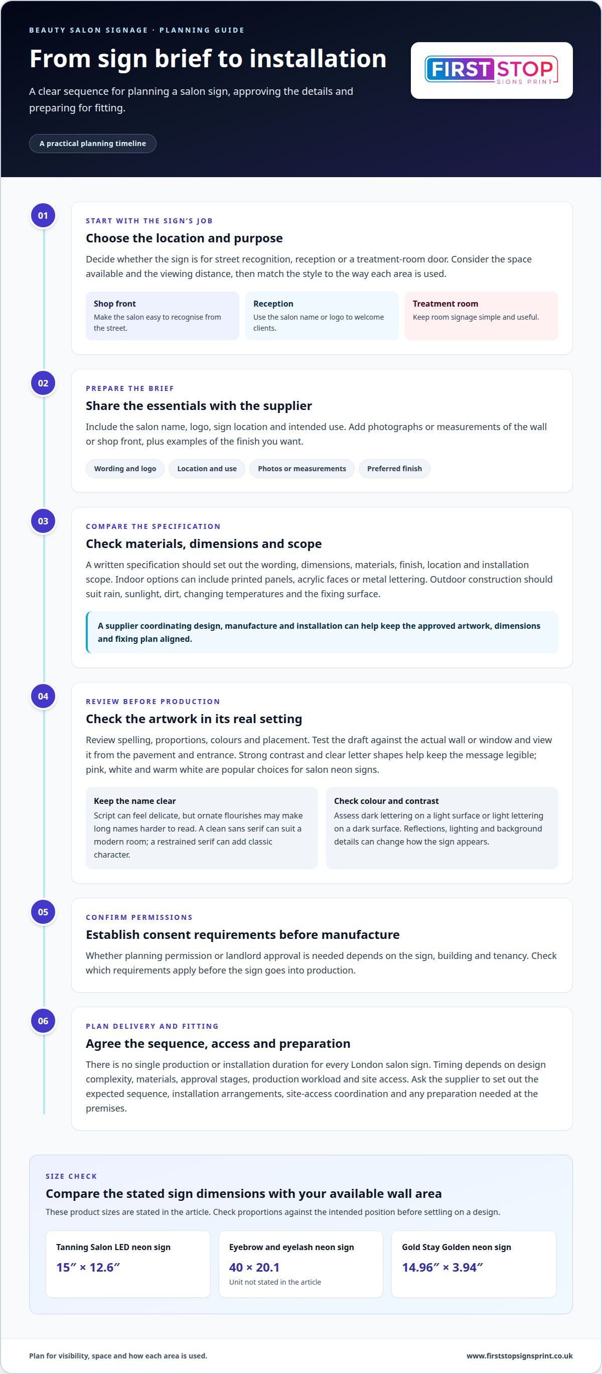
Choose a sign by its location, purpose and viewing distance. Then plan materials, permissions, supplier responsibilities and installation around that choice.
Indoor and outdoor sign materials
Indoor signs can use printed panels, acrylic faces or metal lettering. Choose a finish that suits the wall, reception desk or treatment-room door. Dimensional lettering can add depth behind reception, while a flat panel can keep room information clear. Compare the material with the salon’s furnishings and lighting before approving the design.
Outdoor signs face rain, sunlight, dirt and changing temperatures. Select a construction suited to those conditions and the surface where it will be fixed. Maintenance starts with inspecting the sign and its fixings, then cleaning it with a method suitable for the material. Avoid abrasive cleaning on delicate finishes, and address loose fittings or visible damage promptly.
Supplier choice and sign makers
Compare London sign makers by the work they handle, from design and manufacture to installation. A supplier coordinating these stages can keep the approved artwork, dimensions and fixing plan aligned. Review examples of relevant shop-front and interior work, such as projecting signs, reception lettering or treatment-room panels. Check that the proposed sign suits your building and intended viewing distance.
Compare the clarity of each written specification, too. It should describe the sign’s wording, dimensions, materials, finish, location and installation scope. Confirm who coordinates site access and what preparation the premises need. A useful comparison considers the finished result and practical delivery together, not appearance alone.
Ordering, production and installation
A typical order begins with a brief covering the salon name, logo, sign location and intended use. Share photographs or measurements of the wall or shop front, plus examples of the finish you want. The supplier can then develop a design and specification for approval. Review spelling, proportions, colours and placement carefully before production begins.
There is no single production or installation duration for every London salon sign. Timing depends on design complexity, materials, approval stages, production workload and site access. Ask for the expected sequence and installation arrangements as part of the order. Whether planning permission or landlord approval is needed depends on the sign, building and tenancy, so establish applicable consent requirements before manufacture. For a coordinated project, explore custom signage options.
Product dimensions can help turn a visual preference into a practical comparison. The Tanning Salon LED neon sign measures 15" x 12.6"; the eyebrow and eyelash neon sign measures 40×20.1; and the Gold Stay Golden neon sign measures 14.96”×3.94”. Check each stated size against the available wall area before settling on a design. Considering the sign’s proportions alongside its intended position can help keep it legible without letting it dominate the surrounding space.
The round salon sign is available in a 60 cm size, a 70 cm size and an 80 cm size. Compare these options with the area available and the intended viewing distance, rather than assuming a larger sign is automatically more suitable. Treat the listed dimensions as part of the design decision, alongside the sign’s purpose and the space in which it will be seen.
Salon reception and treatment-room signage
Reception signage should identify the salon and help clients orient themselves on arrival. A salon name or logo gives the main desk a clear focal point, while room labels guide visitors beyond it. Keep the hierarchy simple: make the business identity the most prominent element, then use smaller supporting wording for directions or service information. For example, a reception logo can sit behind the desk, with discreet labels marking individual rooms.
Scale the sign to its position rather than choosing a design in isolation. A Beauty Room LED neon sign measures 40 by 14.4 centimetres, while a personalised logo and name sign measures 20 centimetres by 15 centimetres. These examples show how a compact name panel differs from a wider feature sign. Compare the sign’s dimensions with the wall or desk area, then leave enough clear space around the wording.
Treatment-room signs have a different job: they should provide useful information without competing with the room’s calm atmosphere. A short phrase on a selfie wall can create a photo backdrop, while a simple “Quiet Please” message can signal that a treatment is in progress. A Quiet Please treatment sign measures 10 by 5 inches. For a beauty room with a nail service, a Nails neon sign measures 15.7 by 10.7 inches.
For illuminated signs in the UK, plan the electrical connection, cable route and maintenance access alongside the sign’s position. Include these details in the installation plan, especially if wiring would cross a doorway or sit near a treatment area. The building and sign location also affect whether separate consent is needed, so account for permissions before fixing an illuminated feature.
- At reception: use the salon name or logo as the primary visual marker.
- At a selfie wall: choose a short phrase that remains legible in photographs.
- Outside a treatment room: use concise wording, such as “Quiet Please”.
- Beside a service area: label the specific room or treatment, such as “Nails”.
Before finalising the layout, view each sign from the client’s route through the salon. Check the reception logo from the entrance, then read room labels from the corridor. Confirm that the selfie-wall phrase fits the available background and that treatment notices remain visible without interrupting the room’s purpose. This route-based review helps each sign serve its function while keeping the interior coherent.
Keep reception wording focused on recognition: use the salon’s business name or logo without adding competing messages. For a selfie wall, choose a short phrase rather than a longer explanation, centring the display on a single idea. This gives the two areas distinct roles: reception identifies the salon, while the selfie wall carries a brief phrase for photos.
When reviewing the arrangement, check that the reception identity and selfie-wall wording feel consistent with the salon’s presentation. Apply the same care to both, but keep their messages distinct: the reception sign should feature the business name or logo, and the selfie wall should carry a short phrase. Make each message direct and easy to take in at a glance.
What types of signage are suitable for beauty salons in London?
A London salon may need signs for three distinct jobs: street visibility, brand recognition and indoor navigation. Match each format to its position. A shop-front board identifies the business, reception lettering welcomes clients, and room signs help them find treatments. This prevents one sign from carrying every message.
Shop-front boards suit salons that need a clear name at the entrance. A flat board can display a logo and concise wording, while dimensional lettering adds depth to a fascia. Assess the frontage from the pavement and from the direction clients approach. Nearby shop signs, awnings and architectural details can affect how clearly your name stands out.
Projecting signs extend from a building and can help identify a salon along a busy street. Keep the design simple, with the salon name or a recognisable logo as the main feature. Consider the sightline from both directions and the available fixing position. A projecting sign works best as a prompt to notice the entrance, rather than a place for a long treatment list.
3D letters and logos create a more dimensional feature on a fascia or reception wall. They can make a short business name the focal point without adding extra wording. Check how the letter shapes appear against the building finish. For an interior logo, view the design from the doorway and reception seating, not only from close range.
LED neon signs can add an illuminated feature to a window, reception area or photo backdrop. They are lightweight, low energy and cool to the touch. A short phrase or simple logo is easier to read than a busy design. Use the lighting as an accent, then ensure essential information remains legible when the sign is switched off.
- For the entrance: choose a shop-front board or dimensional name lettering.
- For visibility along the street: consider a projecting sign with a short message.
- For reception: use 3D letters or a logo as a branded focal point.
- For a photo area: select an LED neon phrase that suits the backdrop.
Window graphics can show opening information or highlight a featured service, such as facials or nail treatments. Keep the glass uncluttered so the entrance remains easy to recognise from the pavement. Inside, small directional panels can guide clients from reception towards treatment rooms. Use matching colours and lettering across the fascia, window and interior, while varying each sign’s size to suit its purpose. A coordinated set feels deliberate without making every surface compete for attention.
Which London companies make and install salon signs?
London salon signs are made by sign manufacturers, commercial printers and specialist sign installers. Some businesses handle design, production and fitting; others focus on printing or installation. Match the provider’s work to the sign you need. A shop-front board, illuminated logo and reception feature each require different materials, construction and fixing methods.
Start with the project itself. Write down the sign locations, intended messages and preferred formats, such as a fascia board, projecting sign or dimensional letters. A reception logo may need a different finish from an exterior sign exposed to weather. Clear requirements help you compare proposals on the same basis, rather than weighing unrelated designs or specifications.
Look for relevant examples. A portfolio showing shop fronts, illuminated signs and interior lettering gives you a clearer sense of the maker’s capabilities. Compare the finish, legibility and proportions in examples similar to your salon. A refined reception logo, for instance, may suit a different production approach from bold lettering meant to be noticed across a busy street.
Review the scope of work, not just the visual concept. A useful specification should set out the wording, dimensions, materials, finish, proposed position and installation arrangements. It should also clarify which parts cover manufacture and which cover fitting. This distinction matters if one company produces the sign and another installs it, because each stage affects the final result.
- Design and manufacture: assess whether the proposed layout fits the frontage or interior wall.
- Installation: consider access, fixing position and how the sign will sit against the building.
- Illumination: review the lighting effect, wiring route and access for maintenance.
- Project coordination: compare how artwork approval, production and fitting are organised.
Compare written proposals for the same sign type and location. One might cover a printed fascia, while another includes dimensional letters and installation. Those are different solutions, so compare the materials, finish and work included before judging overall value. If your salon needs several signs, assess how the exterior board, reception logo and room markers will work as one visual system.
For a coordinated project, choose a sign maker whose work covers the required formats and installation stages. First Stop Signs Print produces bespoke signage and offers professional sign installation. Its work includes shop-front boards, 3D signs and LED signs. Share the salon’s sign locations and intended use to shape a practical specification, then review the proposed design and installation scope before production.
First Stop Signs Print: Label Printing
First Stop Signs Print can help bring a salon’s visual identity into its physical space with Custom Business Signs, 3D Wall Panels and Metal Wall Art. These options suit different needs, from a branded feature wall to a distinctive reception area. Label Printing can also support salons selling their own packaged beauty products, keeping product presentation consistent with the wider brand.
When planning a signage project, identify where the salon needs a clear brand presence and whether interior features should complement the main sign. A defined brief covering the space, intended look and required items helps shape a practical solution.
Contact First Stop Signs Print to discuss signage and print options for your salon.
Plan your salon’s next signage step
Turn your ideas for beauty salon signage in London into a practical brief before starting a project. Note which spaces need a sign, what each must communicate and how clients will view it. A street-facing sign may need to identify your salon quickly, while an interior feature can reinforce its character. Keeping those purposes clear makes it easier to discuss a cohesive design.
Bring together your salon name or logo, preferred colours, photographs of the intended locations and any wording for reception or treatment rooms. Note how the signs should relate to your existing décor. These details give the project a useful starting point and focus the conversation on the look and function you want.
First Stop Signs Print offers Label Printing, Custom Business Signs and 3D Wall Panels for salon branding and interiors. If you’re ready to discuss your requirements, contact First Stop Signs Print. A clear brief is a practical first move towards signage that feels distinctly yours.
Frequently Asked Questions
What signage works best for attracting customers to a London salon?
A sign that identifies the salon quickly from the approach is the strongest starting point. On a shared frontage, make the salon name the dominant message and avoid squeezing service lists around it. If the entrance sits back from the pavement, a clear window graphic can help connect the sign to the doorway. Check the view from both directions, especially where parked vehicles or neighbouring displays interrupt the sightline.
How do I design accessible and readable salon signage?
Use plain wording, generous spacing and strong contrast so clients can read signs without deciphering decorative details. Choose familiar letterforms for directions and treatment names, and avoid placing text over busy patterns. Don’t rely on colour alone: pair a coloured marker with a written label, such as “Reception” or “Treatment Room”. Check the sign in the lighting clients will encounter, since glare or dim corners can reduce legibility.


