
A flat sign isn’t always the clearest way to make a business stand out. 3D sign makers in Medway create built-up signs from three-dimensional letters with defined depth and sides, giving indoor and outdoor branding a more dimensional presence. The right format depends on where the sign will sit and what it needs to communicate.
It’s sensible to consider more than appearance: visibility, the surface it will be mounted on and the overall look of the space all shape the choice. Flat cut lettering, for example, can be mounted on small supports to create a floating effect, whilst built-up letters offer a deeper profile.
This guide covers the main options for indoor and outdoor signs, how design and manufacture work, and what to consider for your project. It also explains how to choose a sign style and plan professional installation so the finished design fits its setting.
Key Takeaways
- Choose the sign format around its location, viewing distance and the impression you want to create indoors or outdoors.
- Built-up letters have depth and sides, whilst flat cut lettering can sit off the wall to create a floating effect.
- Design, manufacture and installation each shape how well a sign fits its setting and presents your business.
- Illumination can add visibility and visual impact, so consider how lighting works with the lettering and its surroundings.
- First Stop Signs Print offers Label Printing alongside signage options, helping you consider related visual needs in one place.
Sign design, manufacture, installation and maintenance
In Medway, 3D sign makers turn a brand design into dimensional lettering for a chosen space. The process moves from artwork and fabrication to installation, then routine checks that keep the sign presentable.
Bespoke Sign Design and Artwork
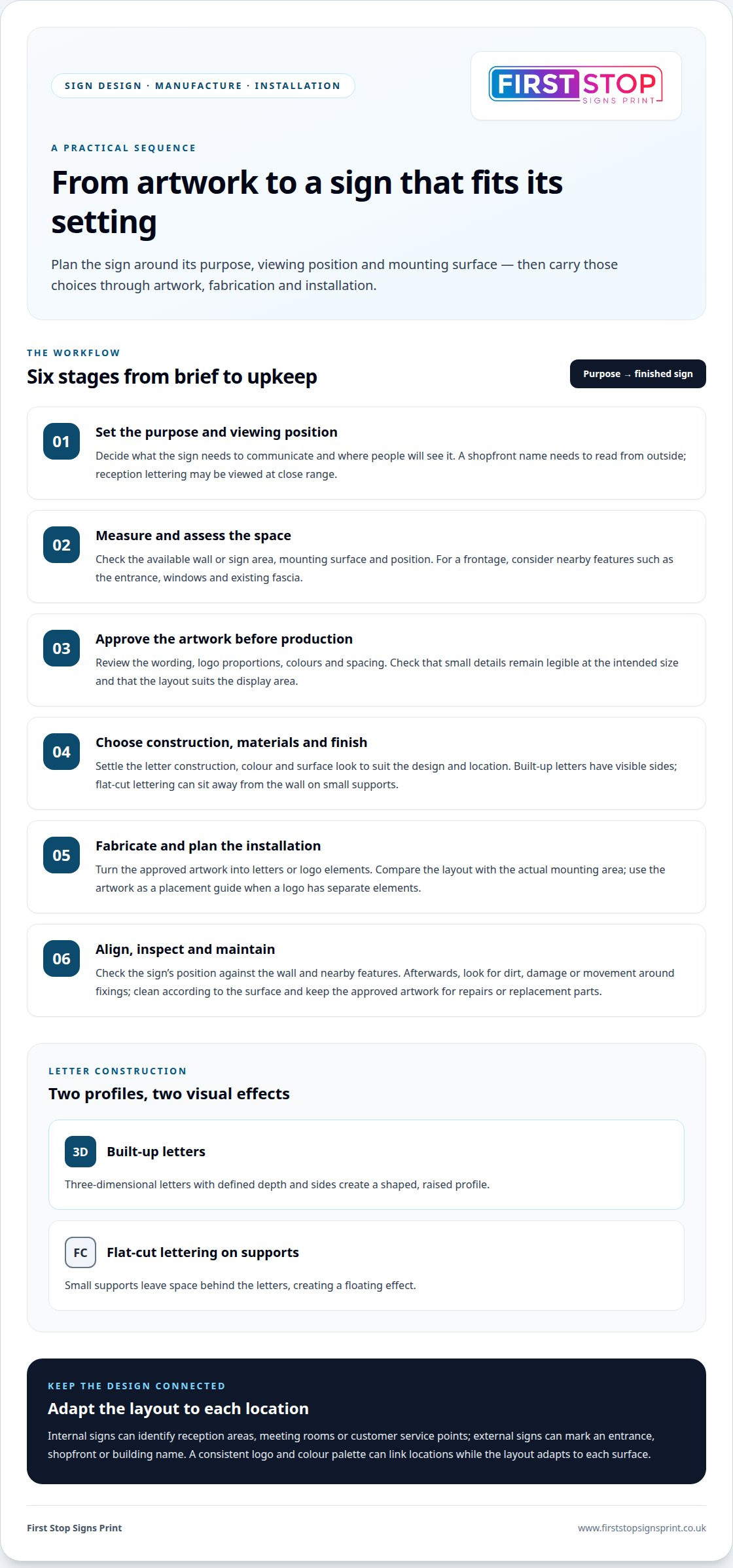
Start with the sign’s purpose, viewing position and mounting surface. A shopfront name needs to be clear from outside, while reception lettering may be viewed at close range. The artwork should show the wording, logo proportions, colours and spacing before production. Check that small details remain legible at the intended size and that the design fits the available wall or sign area.
Three-Dimensional Sign Fabrication
Fabrication turns approved artwork into physical letters or logo elements. Built-up signs have three-dimensional letters with defined depth and sides, creating a shaped profile rather than a flat face. Flat-cut lettering can be mounted on small supports to leave space behind it for a floating effect. The construction affects the sign’s appearance, how far it projects from the wall and how it relates to the mounting surface.
Sign Materials and Finishes
Choose materials and finishes to suit the design, location and intended appearance. Settle the required colour, surface look and letter construction before finalising the artwork. Built-up letters, for example, have visible sides, while flat-cut letters on supports sit away from the wall. The setting and brand style should guide the final selection.
Installation starts by comparing the approved layout with the actual mounting area. The installer needs to consider the wall surface, sign position and alignment with nearby features such as a doorway or window. For a logo made of separate elements, the artwork provides a placement guide. Careful alignment keeps the finished signage balanced and the design clear.
After installation, check the sign visually for dirt, damage or movement around the fixings. Clean it in a way that suits its surface and avoid methods that could mark the finish. If a letter looks loose or a section appears damaged, address the issue before it affects the rest of the display. Keep the approved artwork as a reference for repairs or replacement parts.
A practical workflow is to confirm the purpose, measure the display area, approve the artwork, fabricate the letters and plan installation. For a shopfront, check the wording and logo against the available frontage before production. This sequence links the design to the finished sign and gives you a clear reference for maintenance.
Signage serving Medway and the South East
For businesses in Medway and Kent, three-dimensional signage can identify premises for customers, developers and estates. When reviewing customer feedback about sign makers, look for specific comments on the finished sign, communication and installation, rather than relying on a rating alone.
Signage for Businesses Across Kent
A business in Medway can use dimensional lettering to make its name more recognisable at a shopfront or reception. Across Kent, bespoke signage can also connect separate premises through consistent colours, logos and lettering. Consider where customers first encounter the business, then choose a sign that carries its identity clearly into that space.
Three-dimensional letters have depth and defined sides, giving a sign a profile that differs from flat graphics. This can help a business name stand out against a plain wall or frontage. The effect depends on scale, contrast and surroundings, so consider the viewing position before settling on a design.
Internal and External Signage
Internal signs can identify reception areas, meeting rooms or customer service points. External signs can mark an entrance, shopfront or building name. A consistent logo and colour palette can link these locations, while the layout adapts to each surface. A reception logo might sit behind a desk, for example, while exterior lettering faces the approach.
Choose materials and construction to suit the sign’s location and purpose. An indoor display is viewed in a controlled space, while an outdoor sign forms part of the building frontage. Compare the available wall area, surrounding colours and sightlines. These details affect how the letters read and how the sign fits its setting.
Business and Shopfront Signs
Business and shopfront signs identify a company where customers need to recognise it. Built-up letters give a business name or logo a raised profile, while flat-cut lettering on supports can create a floating appearance. Choose the approach based on the frontage, brand artwork and distance from which passers-by will view the sign.
For a shopfront, check that the wording is legible against the building and nearby features. The sign should work with the entrance, windows and existing fascia, rather than compete with them. Developers and estate managers can use the same principle in shared spaces: choose clear building names, entrance identifiers and consistent visual cues.
For a development, plan signage as a connected set of touchpoints. A main entrance sign can establish the site identity, while signs at individual buildings help visitors find their destination. Internal identifiers can continue the system in shared areas. Bespoke layouts adapt the message to each location while retaining a recognisable design.
Before approving a project, review customer feedback for practical detail. Comments describing a sign’s appearance or installation give more context than a star score alone. Look for examples related to comparable work, such as a shopfront, reception area or estate entrance. This makes reviews more useful when deciding whether a sign style suits your setting.
Indoor and outdoor 3D lettering
Three-dimensional lettering can give a business name a clear presence inside a building or on its frontage. The right arrangement depends on the viewer’s position, the surrounding architecture and the sign’s purpose. A reception logo needs to work at close range, while shopfront lettering must read from the approach. Consider each setting separately, even when both use the same branding.
Inside, raised letters can identify reception desks, meeting areas or customer service points. Their scale should suit the wall and nearby furniture, so the sign feels connected to the space rather than crowded by it. A logo behind a reception desk can act as a focal point without competing with directional signs. Check the view from the entrance and seating area before finalising the layout.
Outdoor lettering needs to identify the business on the building frontage and remain recognisable from the route customers take. Consider a shop name above an entrance alongside the windows, doors and neighbouring visual details. Check the available area, background colour and viewing angle together. These choices help determine letter size, spacing and contrast.
Built-up letters have defined depth and sides, creating a profile that catches light and shadow. This visible form can strengthen a logo’s presence, particularly where a flat graphic might blend into a plain wall. Flat-cut letters mounted on small supports sit away from the wall for a floating effect. Compare both treatments against the actual surface, not just a digital artwork preview.
For consistent branding, use the same logo proportions and colour choices across indoor and outdoor signs, while adapting the layouts to each location. A long business name may need a horizontal arrangement on a shopfront, while a reception wall may suit a compact logo above a desk. Keep the essential design features recognisable, then adjust spacing and positioning to fit each surface.
Before approving 3D lettering, review the artwork at its intended scale and consider how people will approach it. A visitor entering a building reads a sign differently from someone passing a shopfront. Check that individual letters remain clear, the logo retains its shape and the placement supports the sign’s purpose. In Medway, this practical review helps connect a distinctive design with its real setting.
Sign manufacture and printing
Manufacture turns approved artwork into a physical sign, while printing reproduces graphics on a flat surface. A project can use dimensional letters, printed panels or both. A shopfront, for example, could combine raised lettering with a printed panel carrying opening information. Choosing the format early helps align the design, production method and installation plan.
Check the final artwork against the intended sign size and layout. Confirm the business name, logo, wording, colours and spacing before production. A small logo detail that looks clear on screen may be difficult to distinguish when reduced. Reviewing a full-size layout helps identify crowded text or uneven spacing before materials are prepared.
Three-dimensional signs need fabrication that follows the letter shapes and logo components in the approved design. Built-up letters have depth and sides, while flat-cut lettering can be mounted away from a wall on small supports. These forms are made differently from flat printed graphics. Choosing the construction first gives the artwork a clear production purpose.
Printing suits graphics that need to appear across a flat sign area. Digital large format printing can reproduce a designed image or message at a larger display size. For instance, a printed panel could carry a logo alongside supporting information, while separate 3D lettering creates a raised feature. Keep the layout readable and give the main business name clear visual prominence.
Before manufacture, put the content in its final order and check every line. This can catch a misspelt business name or an outdated message. Then compare the artwork with the physical space: a wide fascia needs a different layout from a narrow entrance panel. The available area affects positioning, proportions and how much supporting text fits comfortably.
Production planning should account for how separate sign elements work together. If printed graphics and dimensional letters appear side by side, align their colours, spacing and visual hierarchy in the design. The logo should remain recognisable across both treatments. Reviewing the combined layout, rather than each component alone, helps prevent a printed panel from competing with raised lettering.
Installation follows manufacture and places the finished design in its intended setting. The approved artwork can guide the position of separate letters and printed elements, such as a business name centred above an entrance. After fitting, inspect the sign from the main viewing position. Check that the wording is clear and the printed and dimensional parts work together.
For a project with several printed items, use the same approved logo and colour references across sign artwork and related materials. Labels or flyers can carry a consistent identity alongside the main display. Treat each format as part of one visual system, adapting the layout to its purpose and available space.
Illuminated 3D lettering
Illuminated lettering combines dimensional forms with light to keep a business name prominent in changing conditions. The lighting can emphasise each letter’s face or create a glow around its outline. For a Medway shopfront, compare both effects with the building frontage and the direction people approach from.
Face-lit letters direct light through the front, making the wording the main focus. Halo-lit letters send light behind them, creating a glow on the mounting surface. The effects look different: direct illumination can suit a clearly visible shop name, while a softer outline can give reception lettering a more restrained presence.
Start with the message and viewing position. A short business name above an entrance has different needs from a logo inside a reception area. Consider viewing distance, background colour and nearby lighting together. These factors affect legibility and whether illumination adds useful contrast or distracts from the design.
The artwork needs to suit the chosen lighting effect. Fine strokes, small gaps and intricate logo details can be harder to distinguish when illuminated. Review the design at its intended size, then check that each letter remains legible against the proposed background. A script-style logo, for example, may need careful spacing to preserve its shape when each character is outlined in light.
Consider how the sign will look in daylight as well as after dark. During the day, the letter form, colour and finish carry the design. In low light, illumination changes the emphasis and can make the sign more noticeable. Review both conditions rather than relying on a night-time visual alone.
Plan the layout around the actual site. Note the sign position, mounting surface and nearby windows or entrances. A sign above a doorway should balance with the frontage, while internal letters need to work with the room’s lighting. This site-specific review helps you choose an effect that suits the sign’s purpose.
Before production, approve the wording, logo proportions, colour treatment and lighting appearance together. This connects the illuminated effect to the wider branding instead of treating light as an afterthought. Consider how the sign will sit beside any unlit lettering or printed graphics. Consistent proportions help the whole display feel intentional.
To explore an illuminated lettering project, discuss your sign requirements and the setting where it will be displayed.
First Stop Signs Print: Label Printing
First Stop Signs Print can help if your signage project also needs labels for products, packaging or business materials. Label printing carries your visual identity onto items customers handle, complementing the presence of custom business signs.
For a broader visual project, First Stop Signs Print also offers 3D Wall Panels and Metal Wall Art. These options suit different spaces and purposes, from adding a dimensional feature indoors to creating a decorative focal point. Consider where each item will appear and how it should relate to your existing branding.
Share what your labels or signs need to communicate, where they will be displayed and what artwork you already have. Contact First Stop Signs Print to discuss your requirements.
Plan your next sign project
Before settling on a design, decide what the sign should help visitors do: recognise your business, find an entrance or understand a product. That priority gives the project a clear starting point. If you’re comparing 3D sign makers in Medway, gather your logo artwork, preferred wording and a description of the display space. These details help focus the discussion on your purpose, not just a style in isolation.
You can also explain whether the project is for new premises, a refreshed frontage or a specific indoor feature. A clear goal makes it easier to describe the result you want and how the sign should fit your business.
First Stop Signs Print offers Custom Business Signs, Label Printing and 3D Wall Panels. Label Printing can support product or packaging information, whilst 3D Wall Panels can help shape an interior setting. Choose the requirement that matters most now, then consider how it could connect with your wider visual identity.
Contact First Stop Signs Print about your project and take the next step towards signage that feels right for your space.
Frequently Asked Questions
Why choose us for your sign in Kent?
Choose First Stop Signs Print for a sign project with design, manufacture and installation brought together. Its range includes Custom Business Signs and 3D signs, with a free digital proof showing the proposed sign at actual scale before production. This gives you a chance to review how the design fits your premises. A no-obligation quote is available, so you can discuss the project before deciding how to proceed.
Do you provide 3D sign installation services in Medway, Kent?
First Stop Signs Print offers professional sign installation, and fitting is optional. To discuss installation for a 3D sign in Medway, provide the installation postcode with details of the sign and its intended position. The postcode is needed for an installation request. Sharing whether the sign is for a shopfront, reception area or another setting helps explain the work involved.
3D signage companies near Medway customer reviews
When comparing 3D signage companies near Medway, look for customer reviews describing the finished sign, communication and installation. Comments about comparable projects, such as shopfronts or reception signs, are more useful than a rating alone.


